
Shadow Fox – Logo Design
Project overview
A client came to us wanting a fox logo that didn’t look like the usual animal-mascot design. It wasn’t something sharper, closer to tattoo or streetwear art than a corporate icon.
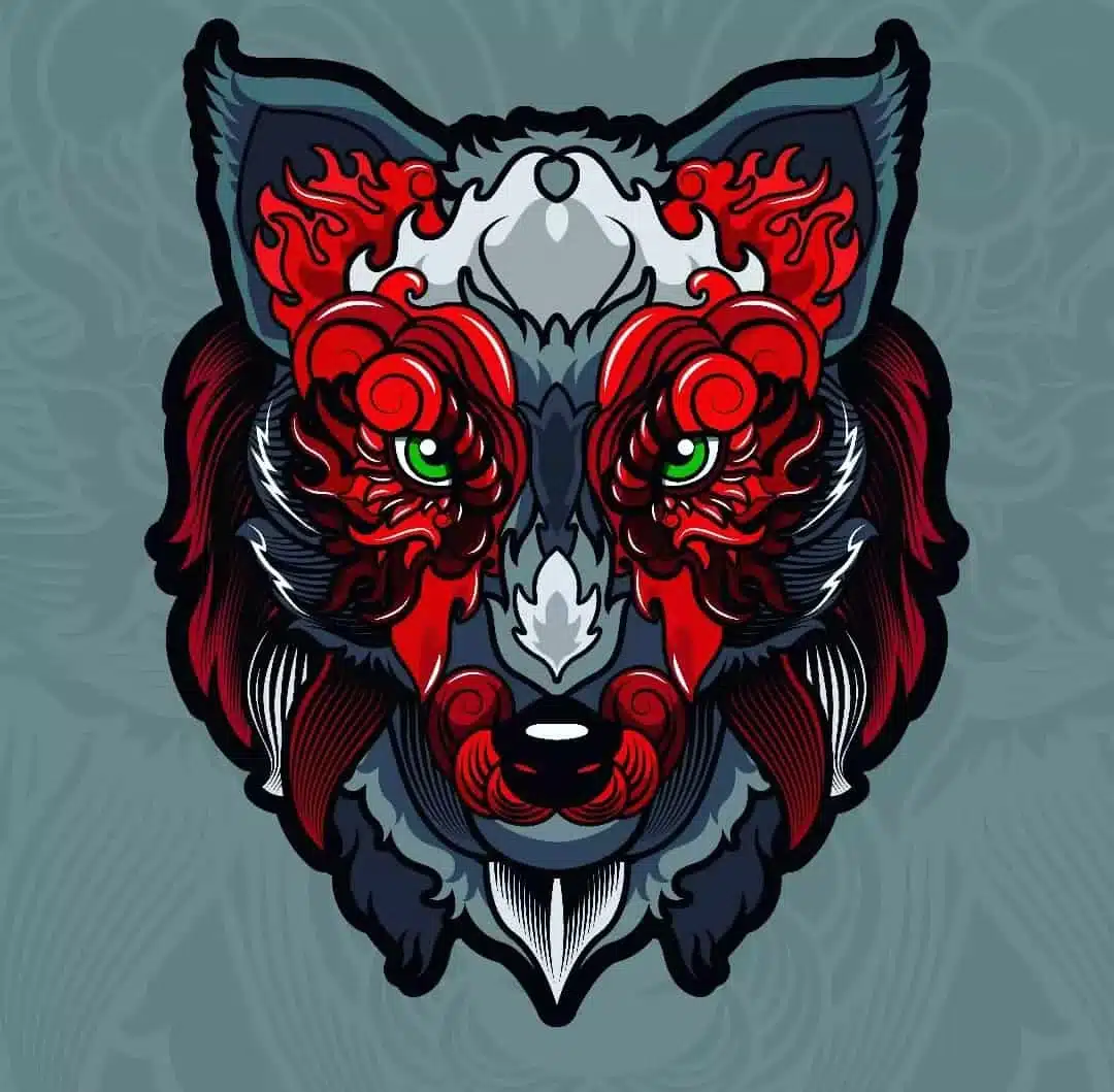
We built the mark around a fox head with red flame patterns running through the fur and bright green eyes as the focal point. It’s meant to hold up on a t-shirt print at full size and on a small app icon, which shaped a lot of the line-weight decisions early on.
Projects Highlighted

Challenges
The brief asked for something aggressive but not messy — a lot of detail without the logo turning into noise once it’s scaled down to favicon size. Red and dark grey together can go muddy fast, so getting the flame pattern to read clearly against the fox’s face without flattening into a blob took a few passes. It also needed to work on both light and dark product backgrounds, which ruled out some of our early color options that only looked right on one.
Approach
We sketched a handful of fox head angles first to find one with enough attitude without looking cartoonish. Once we picked the pose, the flame motif was built in layers around the eyes and jaw rather than as a flat overlay, which is what gives it depth at larger sizes. Color-wise we landed on a dark grey base with saturated red for the flames and a green that’s warm enough to not clash with the red, that contrast is doing most of the work in making the eyes the first thing you see. Final pass was cleaning up the linework so the small details don’t disappear once the logo shrinks down.
Results
The client is using the finished mark across apparel, packaging, and their app icon. It reads clearly at small sizes, which was the main risk going in, and holds its contrast on both light and dark backgrounds without needing a separate color version for each.